


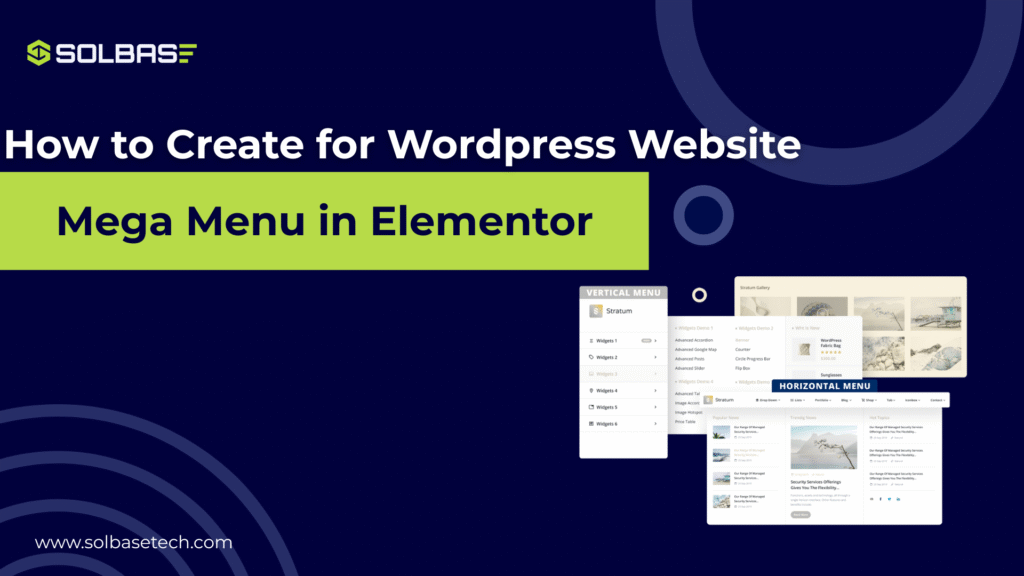
How to Create a Mega Menu in Elementor Pro for Your WordPress Website
Are you struggling to make your mega menu in elementor pro? As your website grows, finding a way to organize your content and make it accessible to users becomes essential.
One of the most effective solutions is the Elementor mega menu. With its advanced features, Elementor allows you to create stunning and functional mega menus without needing additional plugins.
This guide will show you exactly how to set up your Elementor mega menu, step by step, so you can enhance the navigation on your WordPress site.
Keep reading to learn how to create a smooth, intuitive, and beautiful mega menu with Elementor Pro.
What is a Mega Menu in Elementor Pro and Why Your Website Needs One
A mega menu is a large, expandable menu that displays multiple categories or links at once. Unlike traditional dropdown menus, which only show a limited number of links, mega menus can display multiple levels of navigation in a single view. This makes them perfect for websites with a lot of content, such as e-commerce stores or educational platforms.
By using an Elementor mega menu, you’re offering your visitors a more efficient navigation experience, reducing the number of clicks needed to access different parts of your website.
Here are some reasons why you might want to implement a mega menu:
- Better Organization: It allows you to group related content into categories.
- Enhanced User Experience: Users can find what they need faster, improving overall site engagement.
- Aesthetic Appeal: A clean and visually appealing menu elevates your website’s design.
Whether you have a growing eCommerce store or a content-rich blog, an Elementor mega menu helps your visitors find what they’re looking for with minimal effort.
Step-by-Step Guide to Creating a Mega Menu in WordPress with Elementor Pro
Creating a mega menu in Elementor is simple, even for beginners. Follow these easy steps to build your own mega menu and improve your website’s navigation:
Step 1: Activate Menu Features and Nested Elements
Before you start building your mega menu, you need to enable some key features in Elementor.
- Go to your WordPress Dashboard → Elementor → Settings.
- Click on the Features tab.
- Make sure the following options are turned on:
- Nested Elements (this allows you to create dropdown menus inside your Nav Menu).
- Menu Enhancements (this gives you better control over the menu items).
- Hit Save Changes.
✅ Now, your Elementor will support advanced layouts for mega menus.
Remember to check how your mega menu looks across different devices. It’s important that it’s responsive and works smoothly on desktops, tablets, and smartphones. Since many visitors will access your site on mobile devices, optimizing the menu for mobile is key to keeping users engaged.
Step 2: Create or Edit Your Header in Theme Builder
- Go to Elementor → Theme Builder.
- Find Header in the Theme Builder:
- If you already have a header, click Edit.
- If not, create a new header by clicking Add New.
- Inside the header template:
- Drag and drop the Nav Menu widget into your design.
Step 3: Choose Your Menu and Add Content
- Go to WordPress Dashboard → Appearance → Menus and select the menu you want to use.
- In the Nav Menu widget, choose the layout type (Horizontal, Dropdown, etc.).
- Style your menu’s typography, colors, and spacing to match your design.
- Start adding content to your mega menu:
- Use Inner Sections inside the menu items to organize content.
- Add Images, Text, Icons, and Links.
- Create multi-column layouts using Nested Elements.
You can add:
- Service categories
- Featured products
- Blog posts
- Custom buttons
Step 4: Design the Mega Menu for Desktop and Mobile
- Adjust the width, padding, and alignment of your menu’s dropdown.
- Customize the background colors, borders, and hover effects to match your site’s style.
- Optimize the mega menu for mobile:
- You may want to simplify the mobile version of your menu for easier navigation.
Step 5: Now save it and test your Mega Menu
- After finishing your customizations, click Publish or Update your header.
- Visit your site and hover over the menu items your mega menu should now appear!
- Test the menu on mobile and tablet views to ensure it’s fully responsive.
Customization Tips for Your Elementor Mega Menu
To make sure your Elementor mega menu looks polished and is user-friendly, here are some customization tips:
- Use Icons: Adding icons next to menu items can help users quickly identify the section they need.
- Highlight Active Links: Use styles like bold or a different color to highlight the currently active menu item.
- Mobile Optimization: Make sure your mega menu is mobile-friendly. Elementor allows you to adjust settings for different screen sizes, ensuring your menu remains accessible on all devices.
- Interactive Effects: Spice up your menu with hover animations and other interactive effects that make your site more engaging for visitors.
Best Practices for Mega Menu Design
To ensure your Elementor mega menu enhances the user experience, follow these best practices for its design:
- Keep It Simple: Avoid overcrowding the mega menu with too many options. Stick to essential categories and subcategories to maintain a clean look.
- Use Clear Labels: Ensure each menu item is clearly labeled. Avoid ambiguous terms, and make it easy for users to know what they’ll find when they click on each menu item.
- Consistent Styling: Make sure the mega menu’s design aligns with your website’s overall theme. Use consistent fonts, colors, and icons to create a seamless experience.
Conclusion: Create a Mega Menu Without Any Plugins in Elementor Pro
By now, you should have a good understanding of how to create a mega menu on your WordPress site using Elementor Pro. The best part is, you don’t need any additional plugins or coding skills to implement this feature.
With Elementor’s intuitive drag-and-drop interface, you can design a mega menu that enhances both the functionality and aesthetic appeal of your website.
Whether you’re building an online store, a blog, or a membership site, a well-designed Elementor mega menu can improve your site’s usability and help your visitors find what they’re looking for with ease.
Ready to transform your website’s navigation? Start building your Elementor mega menu today, and enjoy a more organized, efficient, and visually stunning site!
Contact us now and get powerful, conversion-focused designs crafted exclusively for your brand.
External Resource:
Check out this comprehensive Elementor mega menu guide to dive deeper into advanced features and tips.